Project: Branding and Packaging
Client: PAARF Germany
_________
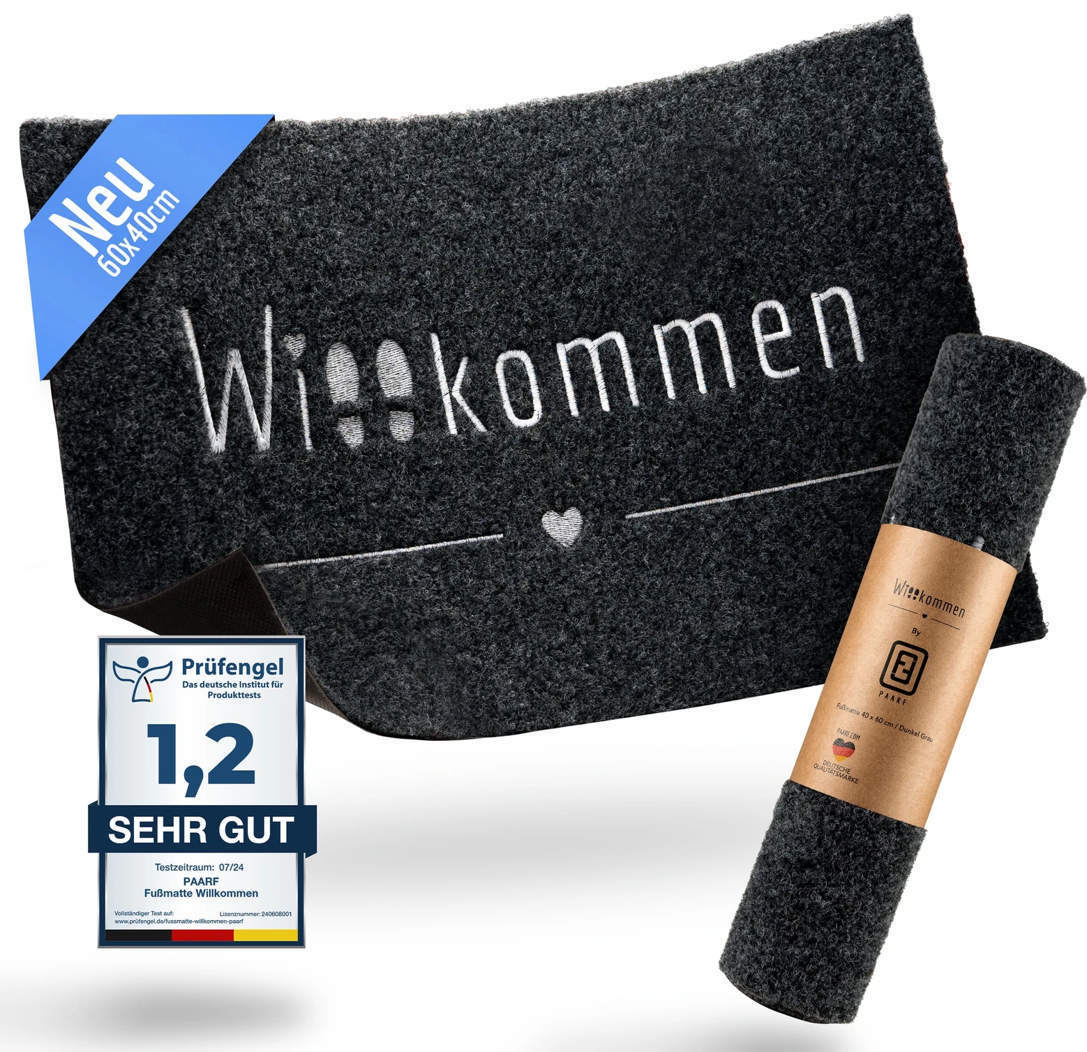
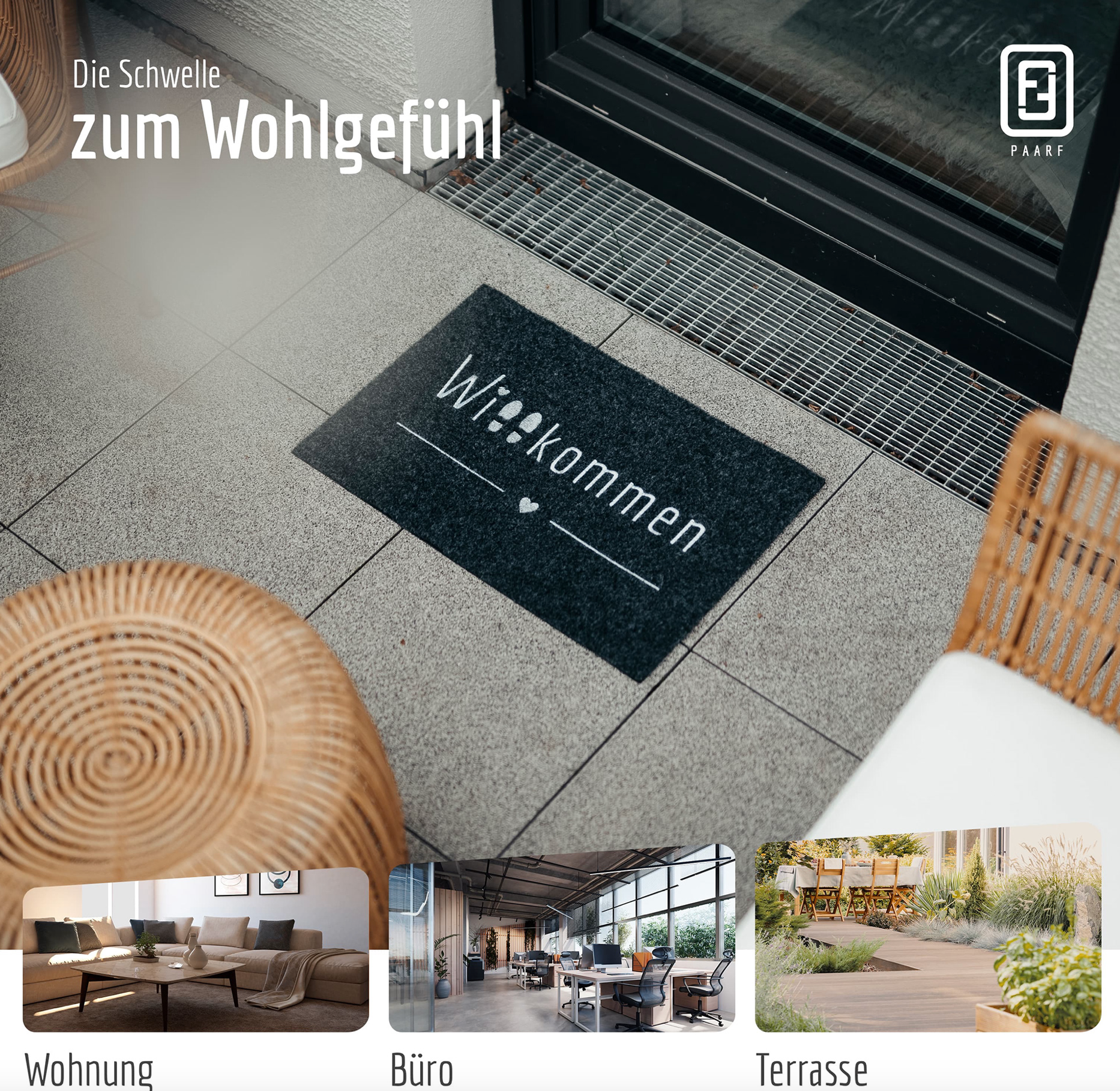
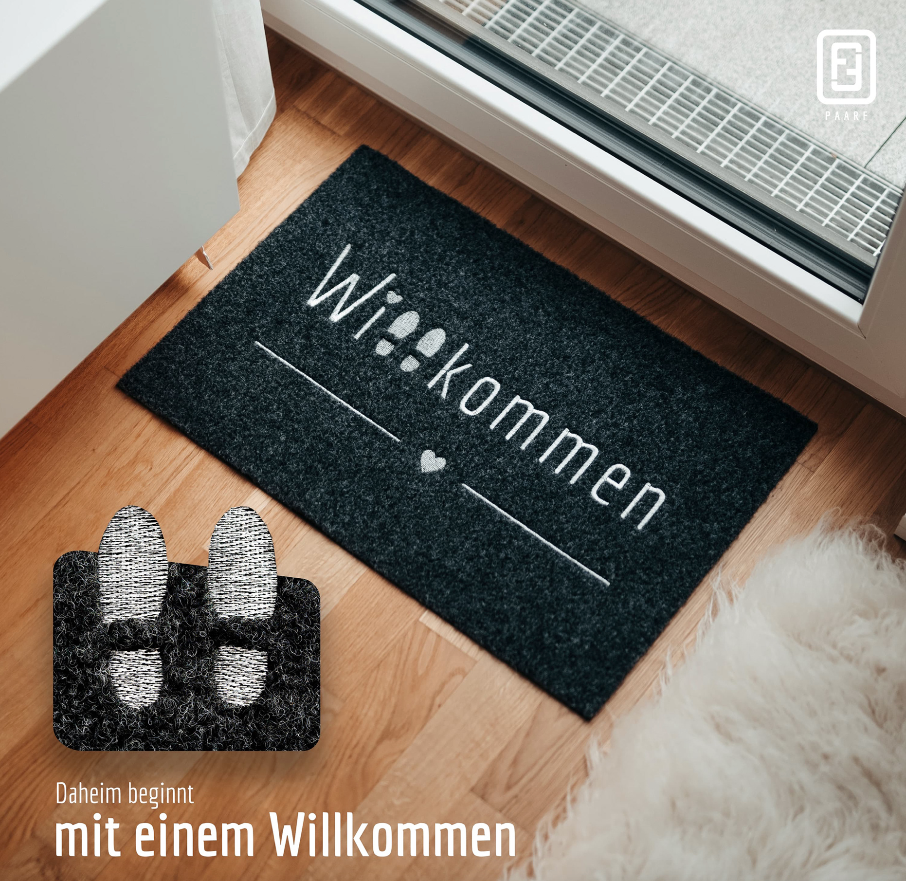
They are a company that offers a variety of rugs and carpets for the home, specializing in entryway, bathroom, bedroom, and kitchen rugs. Their primary differentiator is that both their products and their service embody a more human approach, providing a warmer, more transparent, and natural experience.
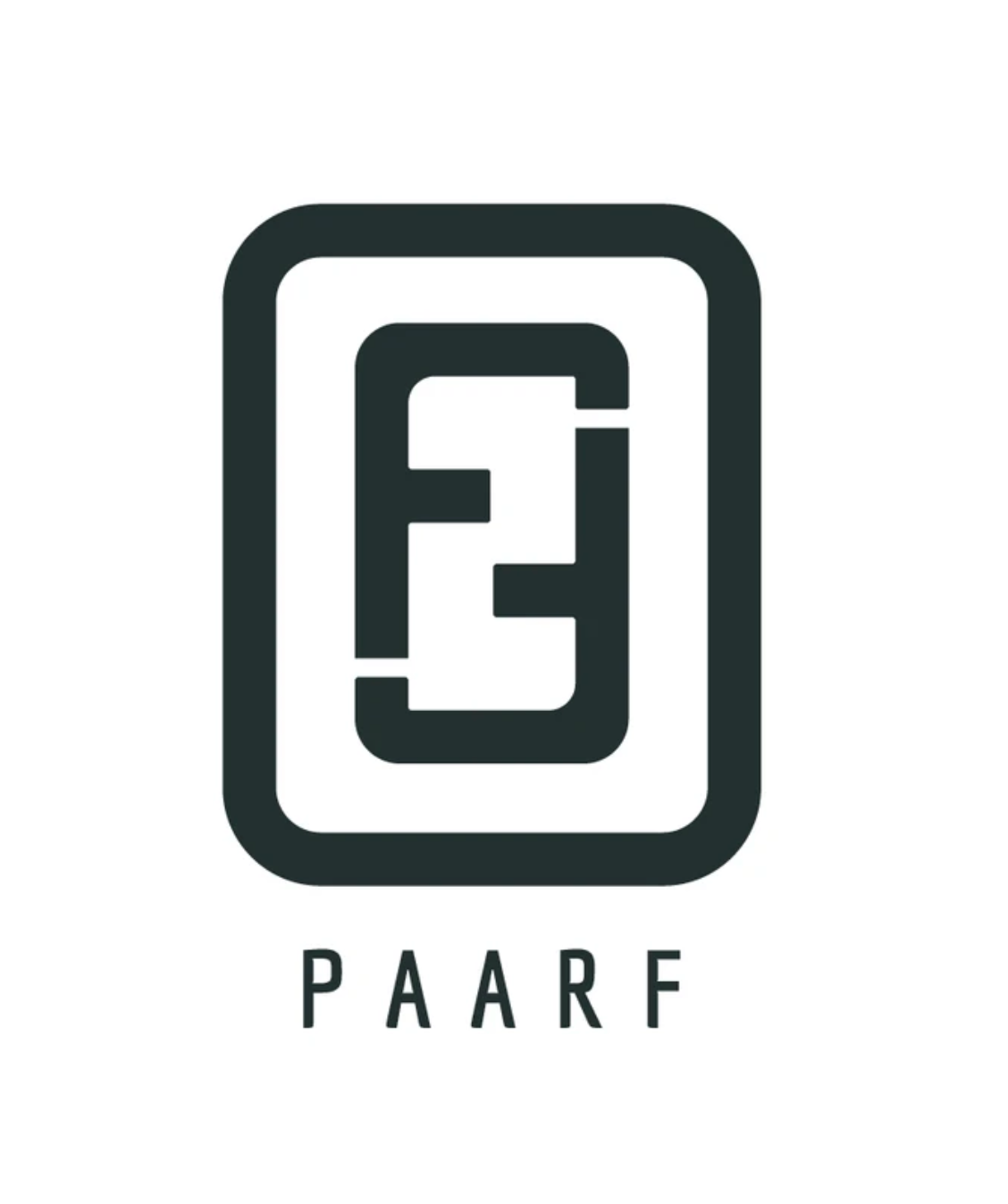
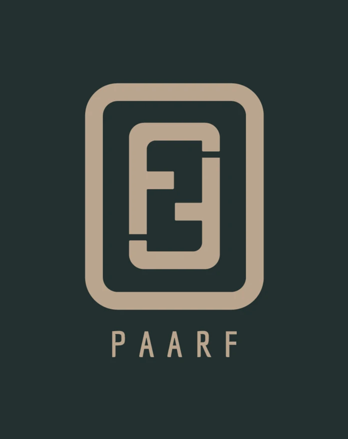
The logo is inspired in their story, they are a couple of foreigners united in Germany. The "F's" form a number two, symbolizing unity and strength. Additionally, "PAARF" means "pair" or "couple" in German, reflecting this concept in their brand.
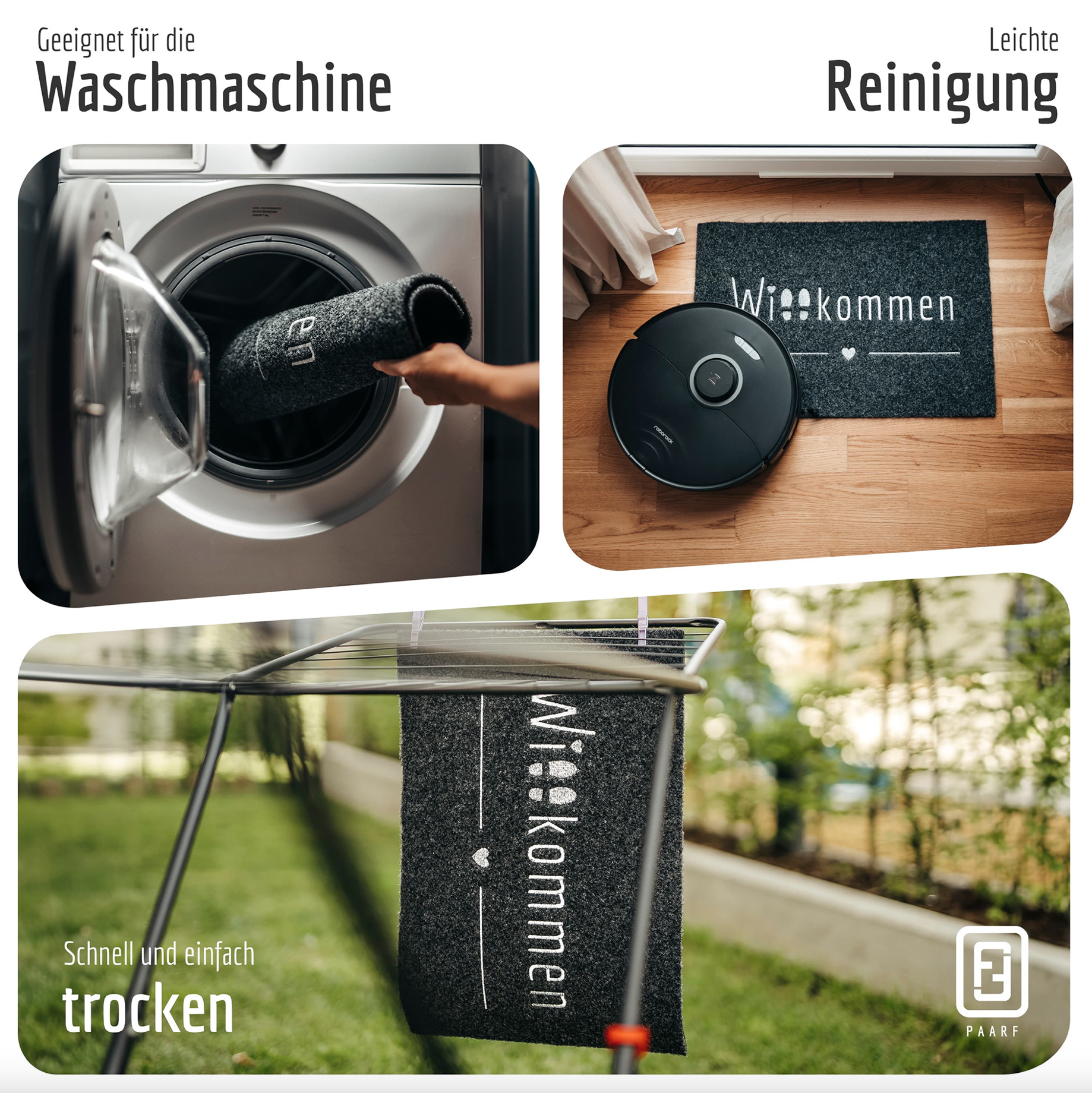
For the packaging PAARF wanted something functional, practical and environmental friendly.