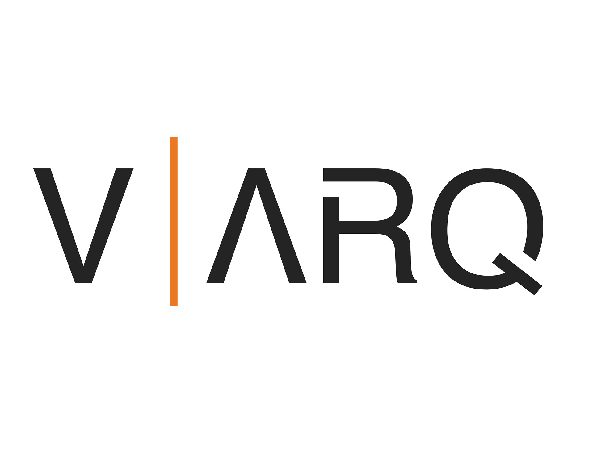
Project: Brand Identity
Client: EV | ARQ
Illustrator | Indesign
_________
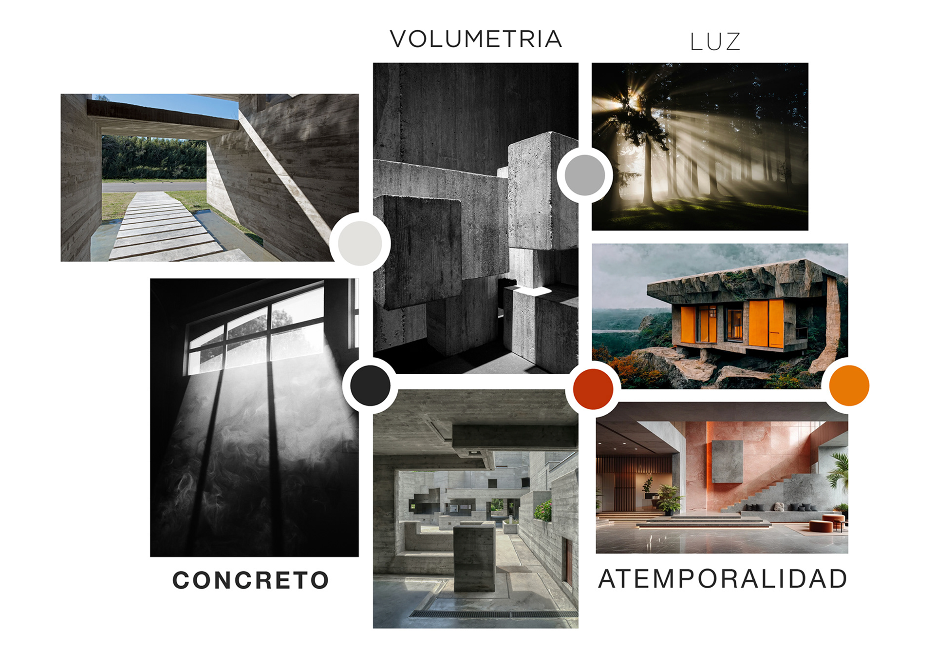
Inspired by the texture and solidity of concrete, conveying strength and durability. The use of negative spaces and the inversion of characters represent the play of light and shadow, adding depth and dynamism to the design. The simplicity and clarity of the logo ensure that it is versatile and durable, reflecting an aesthetic unaffected by fleeting trends.
Wanted to create a logo that perfectly encapsulates the essence of V | ARQ as an innovative and solid architectural firm. This symbolizes the firm’s ability to create impactful, functional, enduring, and safe spaces that interact with the space and the environment.