Project: Branding
Client: EV | ARQ Architecture Studio in Medellin Colombia.
_________
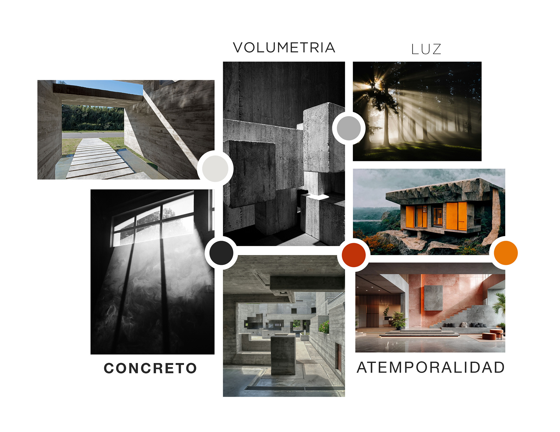
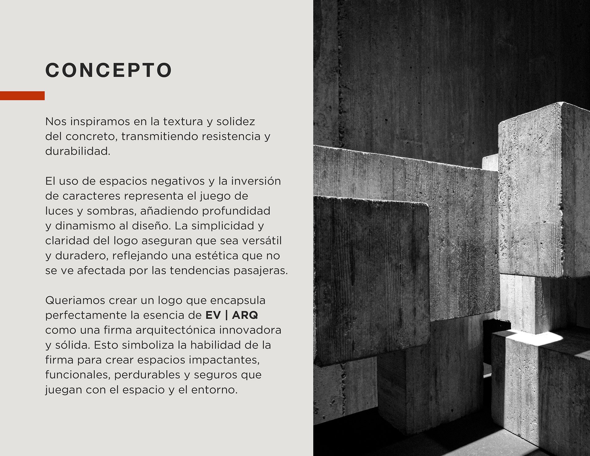
Inspired by the texture and solidity of concrete, conveying strength and durability. The use of negative spaces and the inversion of characters represent the play of light and shadow, adding depth and dynamism to the design. The simplicity and clarity of the logo ensure that it is versatile and durable, reflecting an aesthetic unaffected by fleeting trends.
Wanted to create a logo that perfectly encapsulates the essence of EV | ARQ as an innovative and solid architectural firm. This symbolizes the firm's ability to create impactful, functional, enduring, and safe spaces that interact with the space and the environment.
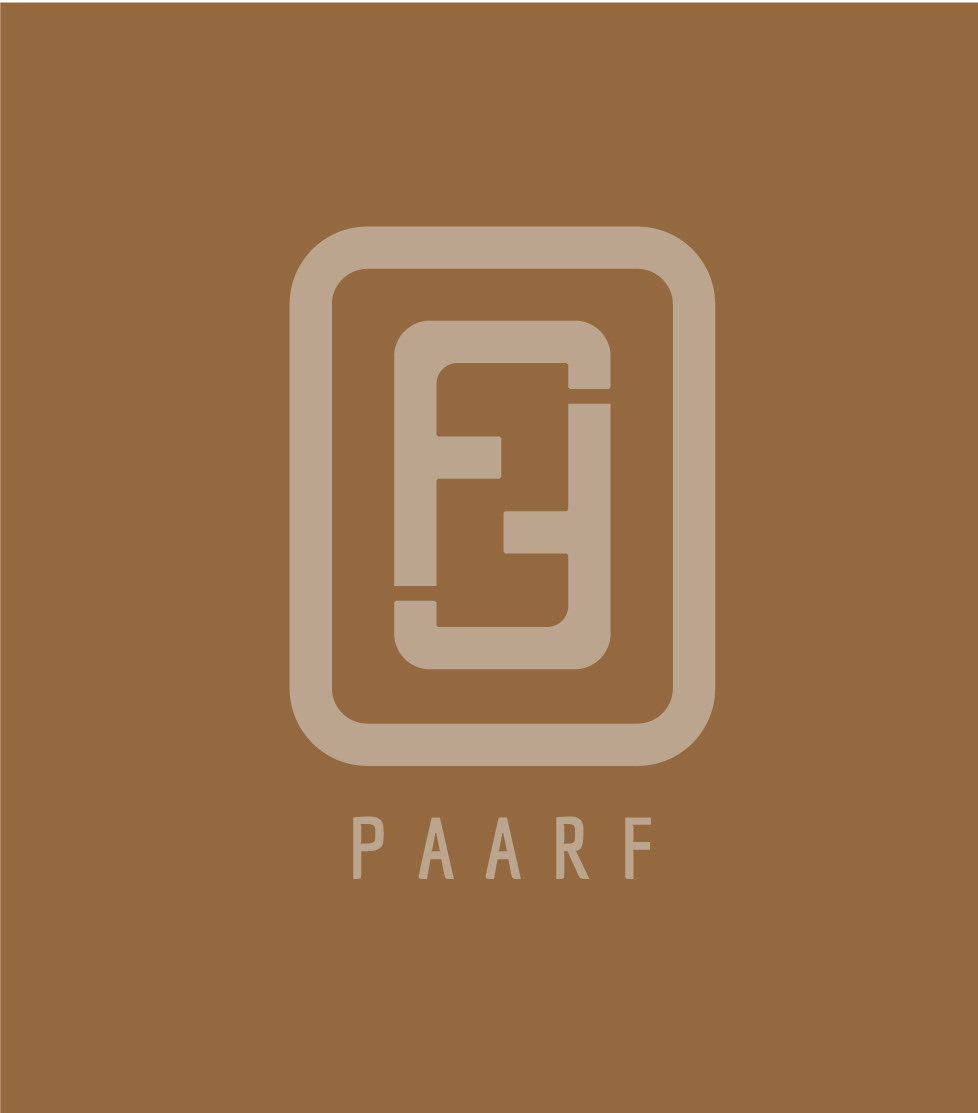
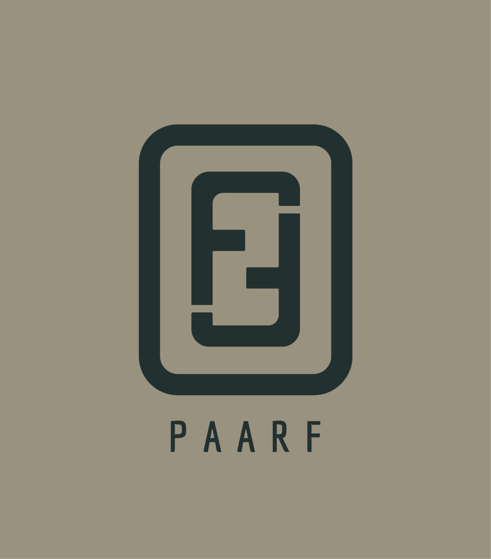
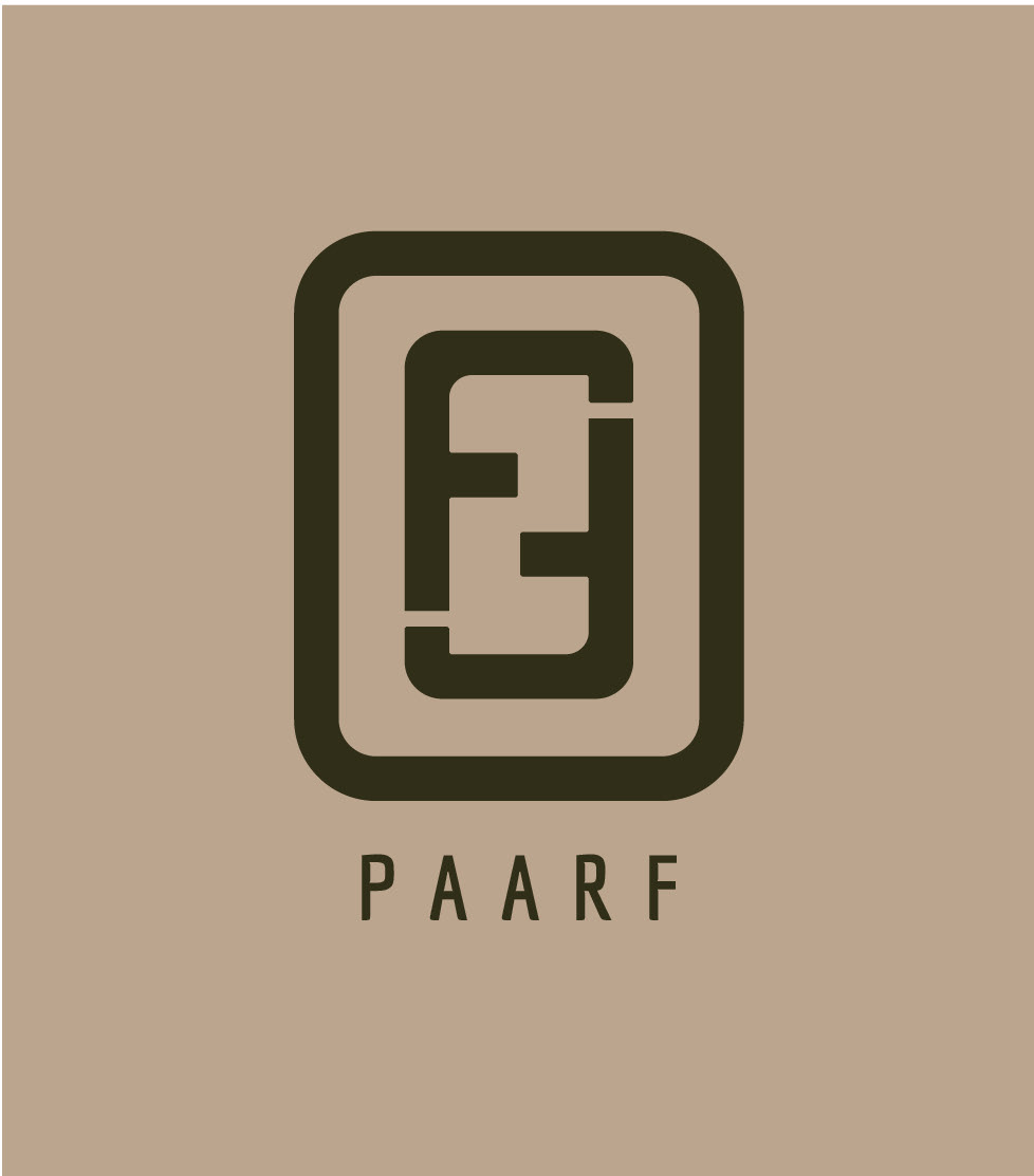
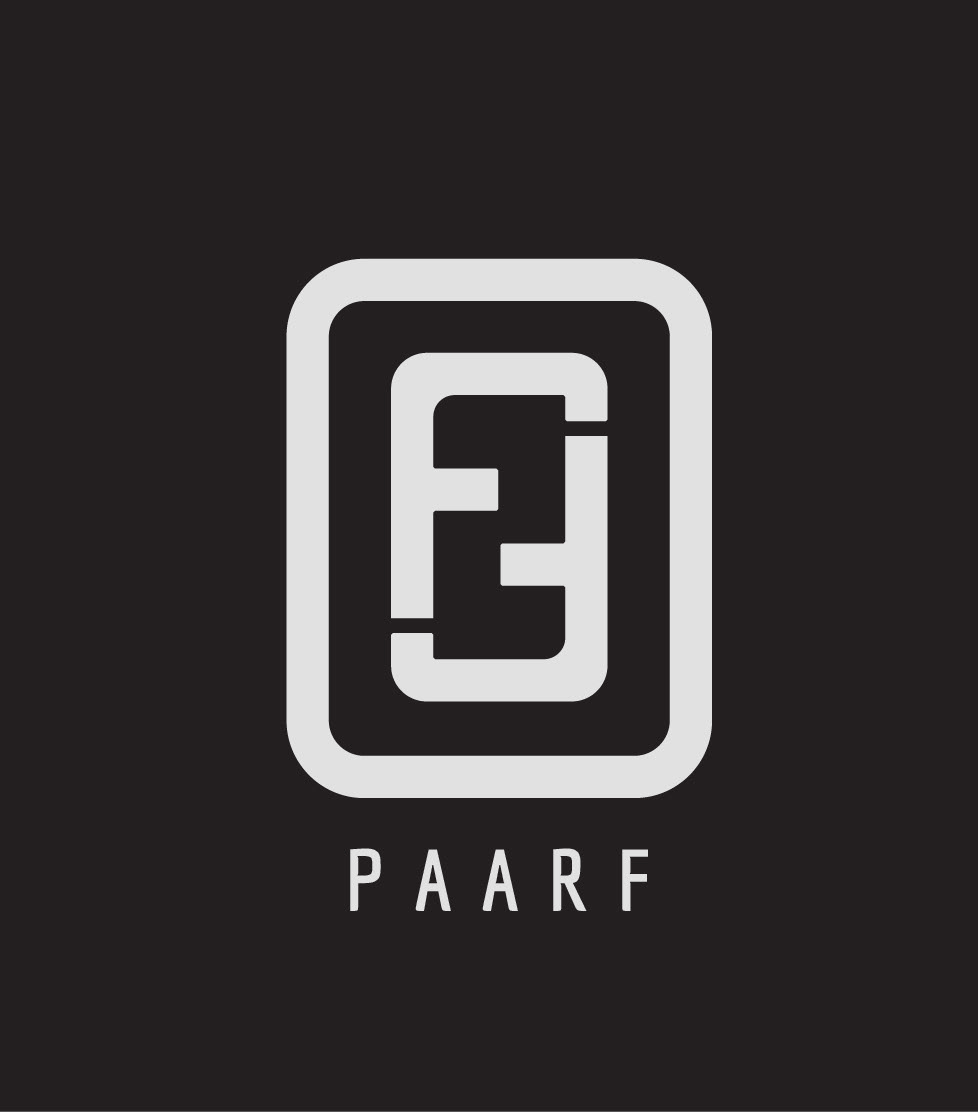
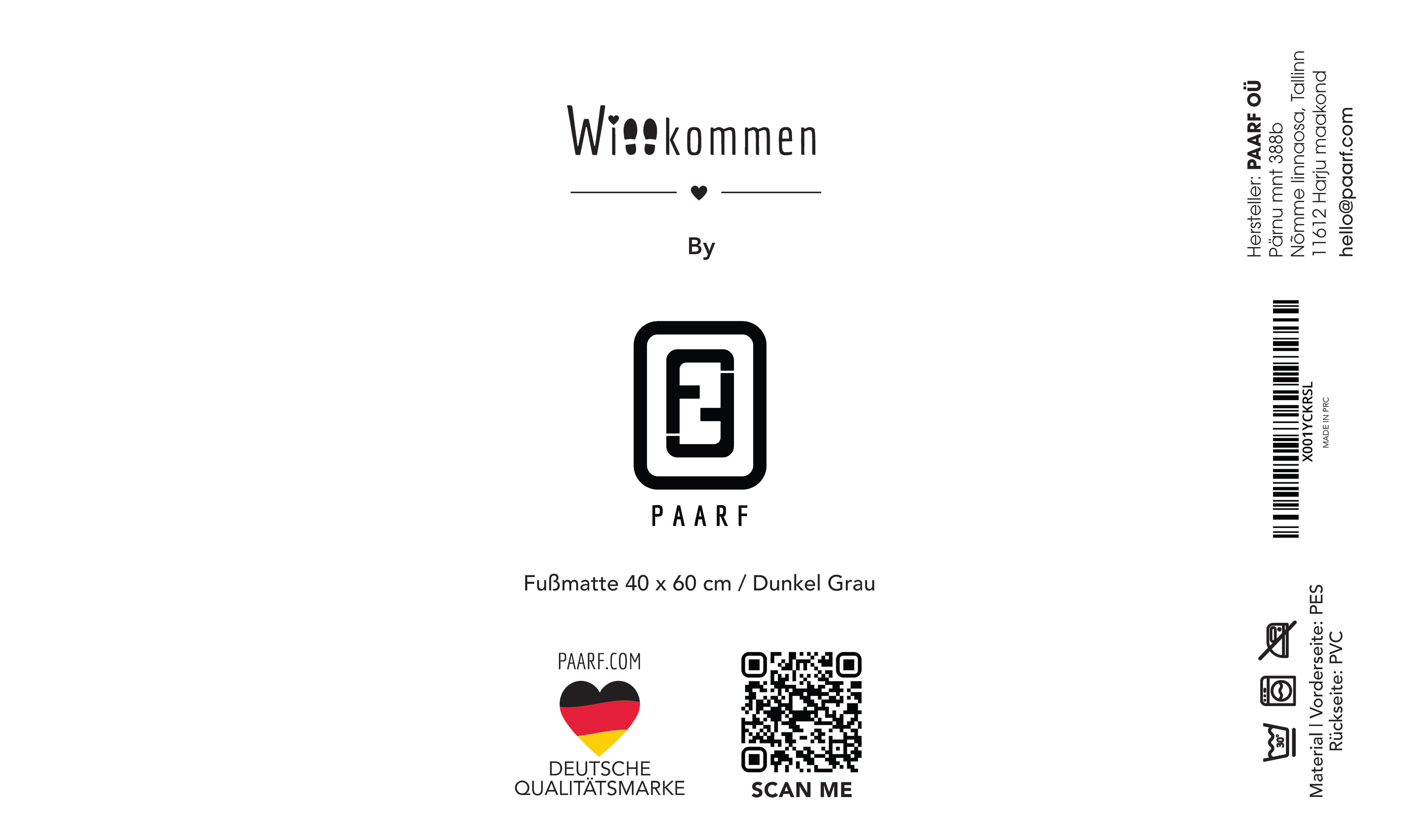
Project: Branding and Packaging
Client: PAARF Germany
_________
They are a company that offers a variety of rugs and carpets for the home, specializing in entryway, bathroom, bedroom, and kitchen rugs. Their primary differentiator is that both their products and their service embody a more human approach, providing a warmer, more transparent, and natural experience.
The logo is inspired in their story, they are a couple of foreigners united in Germany. The "F's" form a number two, symbolizing unity and strength. Additionally, "PAARF" means "pair" or "couple" in German, reflecting this concept in their brand.
For the packaging PAARF wanted something functional, practical and environmental friendly.


Project: Branding
Client: PAARF Germany
_________
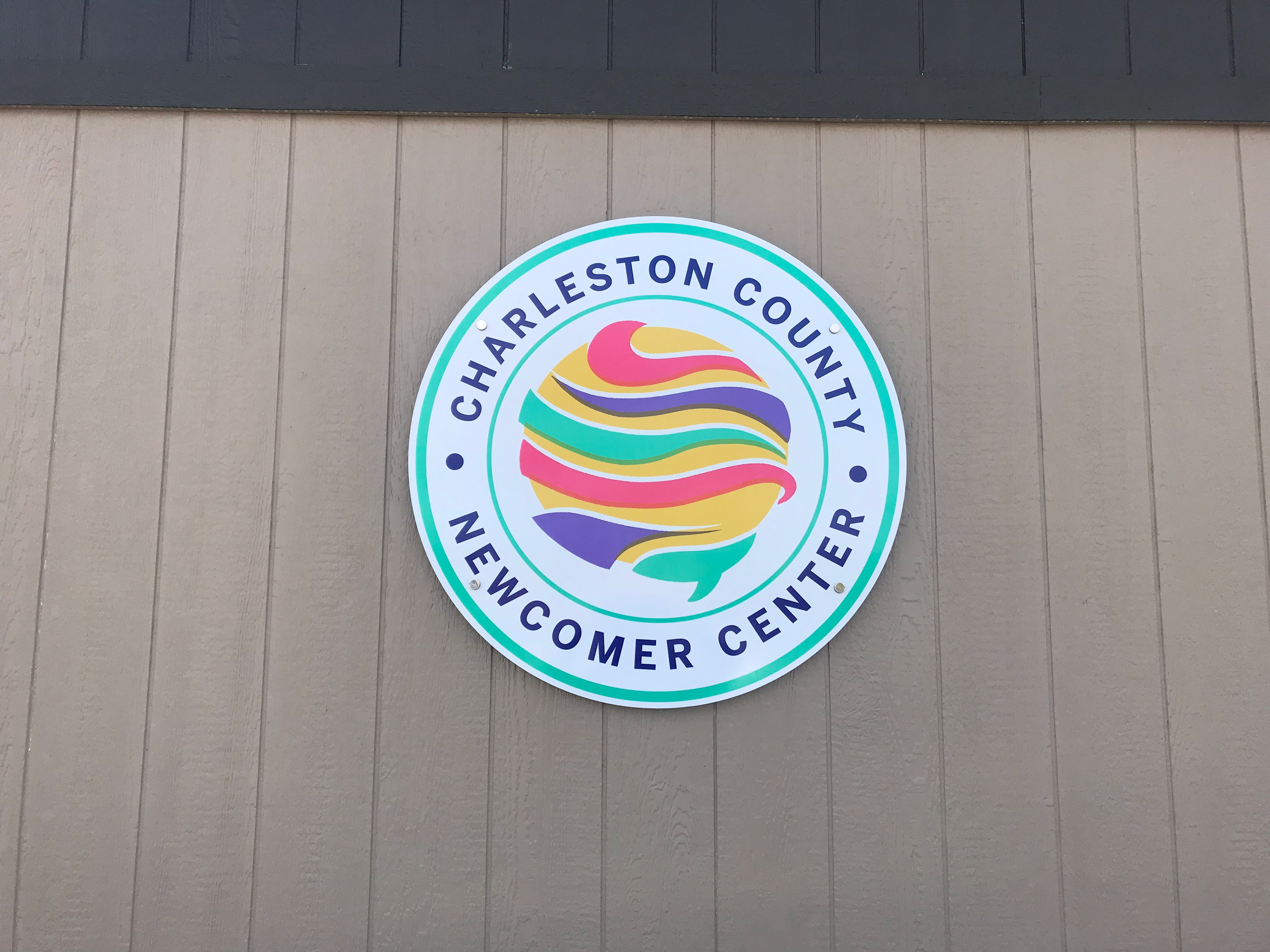
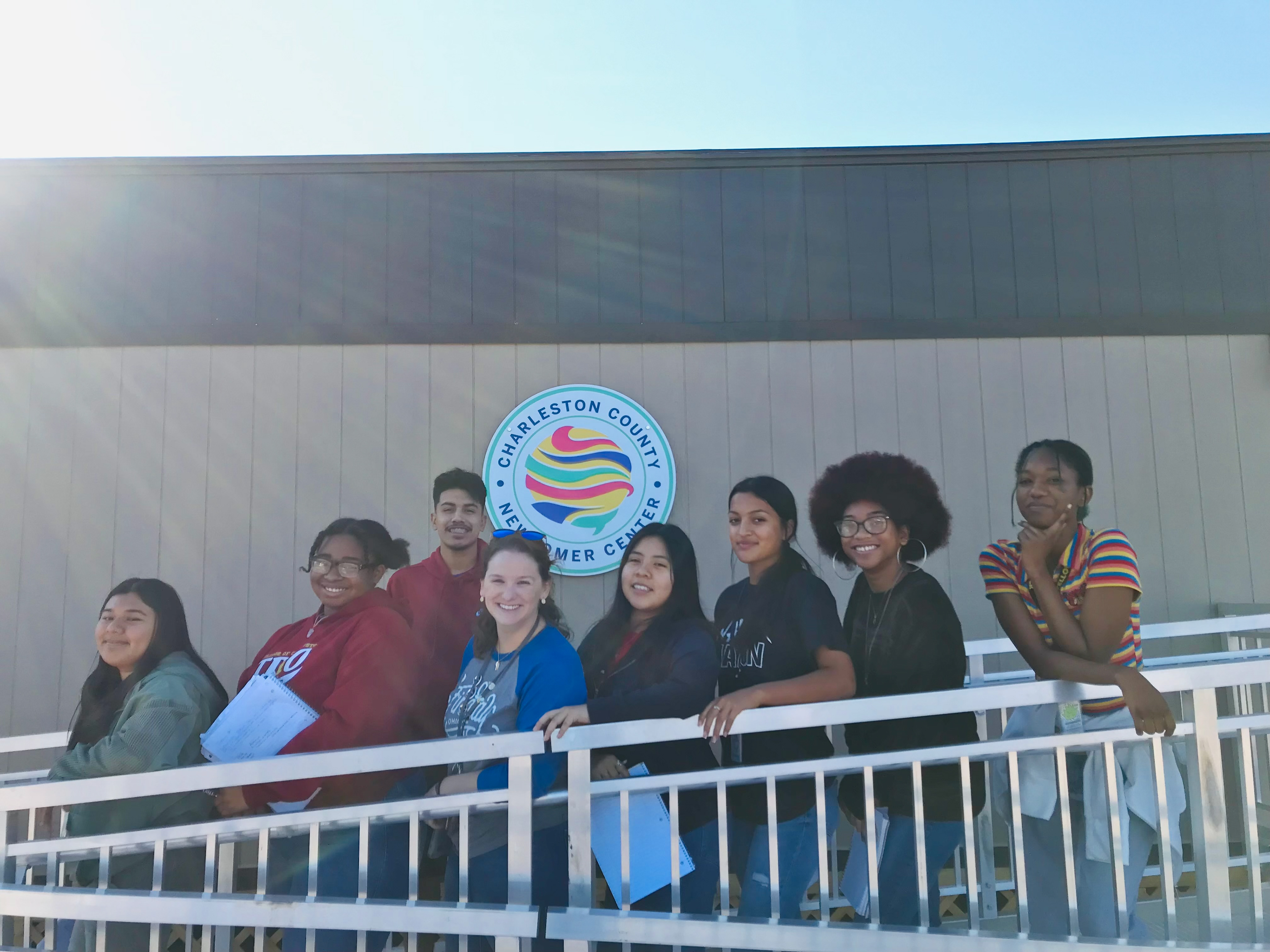
Inspired by the children from all over the world who emigrate to the USA,the logo is an abstract planet with 7 stripes, each representing one of the 7 continents from which your students come. The logo is vibrant and colorful, using striking colors to symbolize the joy and liveliness that newcomers seek when they arrive in this country. The colors reflect the uplifting and life-giving energy that we aim to bring to their experience.